Make UPlace recommendations more competitive by reflecting local underwriting strategy.
Remove reliance on engineers for override requests.
Let underwriters prioritize based on appetite, region, and partnerships.
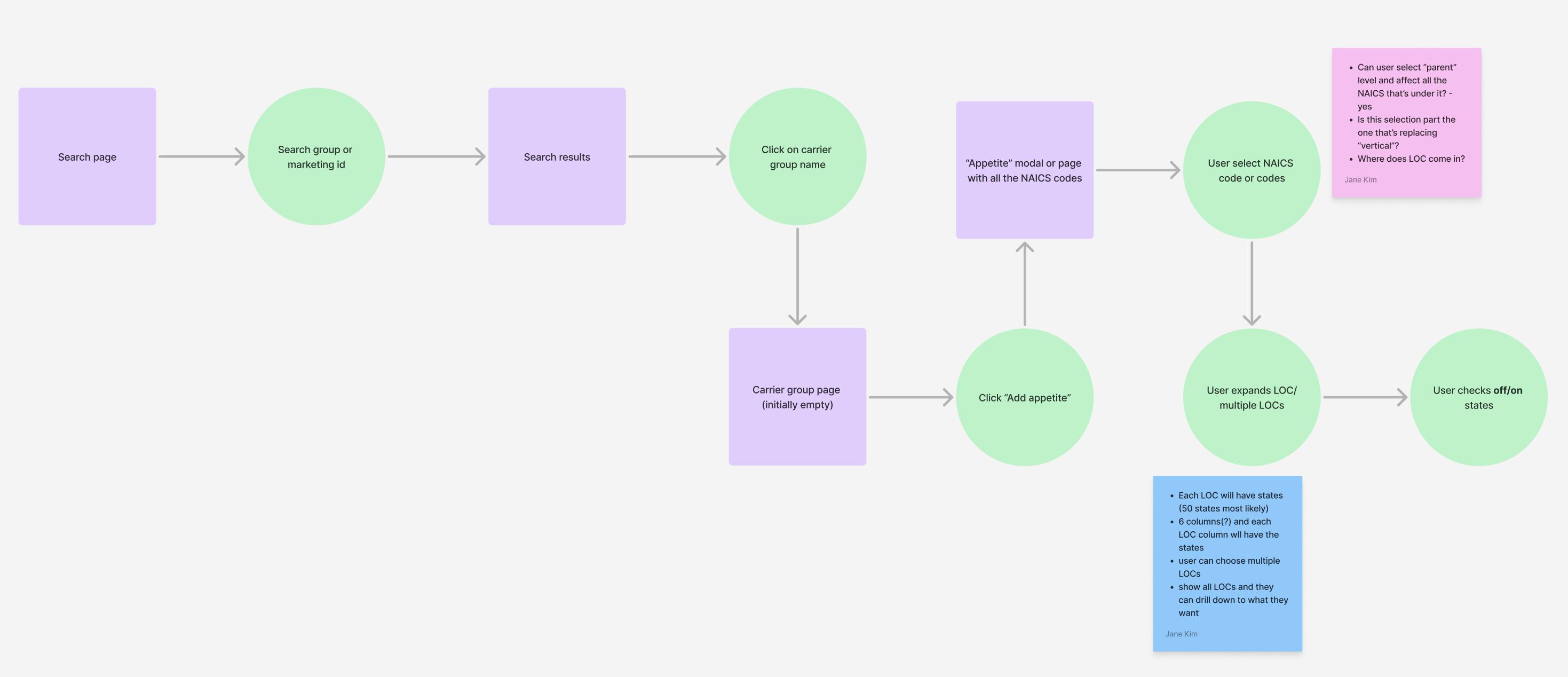
To avoid designing based on assumptions, I grounded decisions in real user behavior. I focused on when underwriters override recommendations, what level of control they need, and how to build trust in the tool.
Underwriters couldn’t update rankings themselves- every change required backend support.
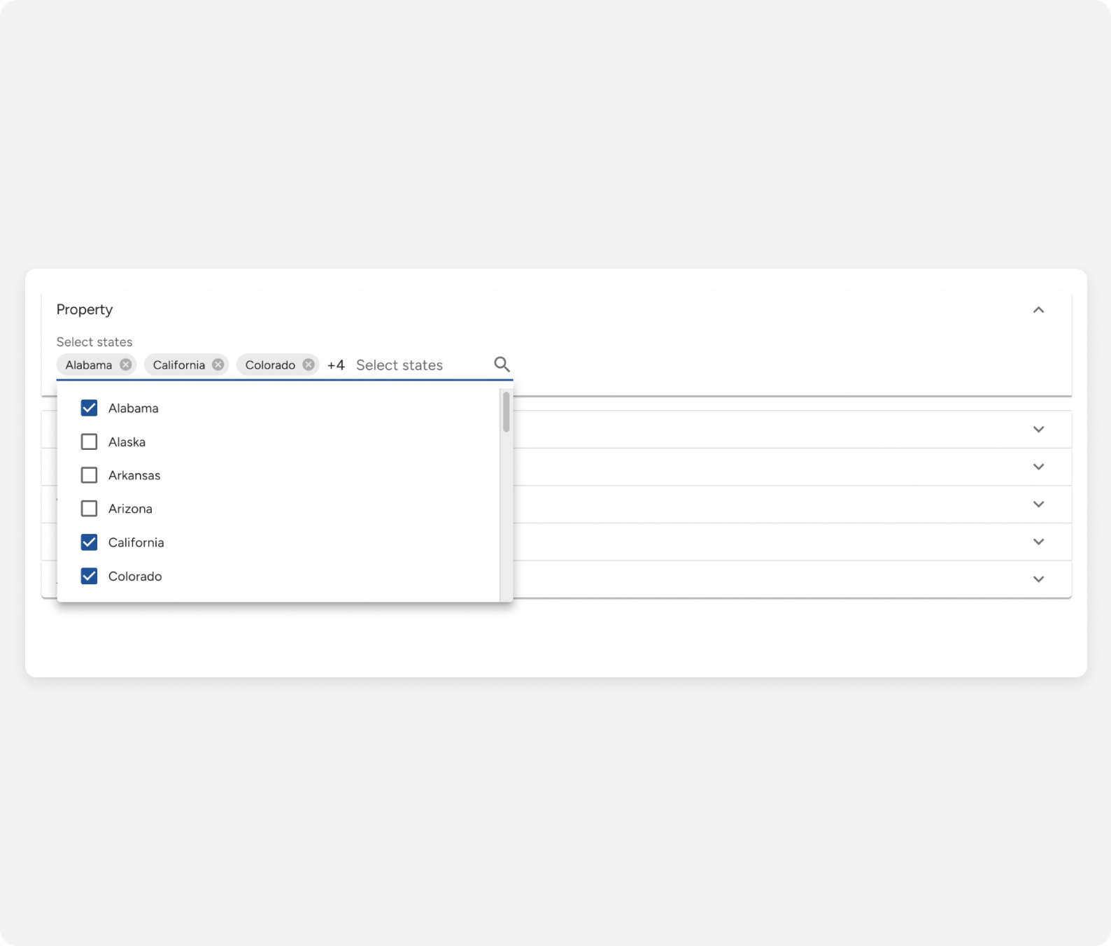
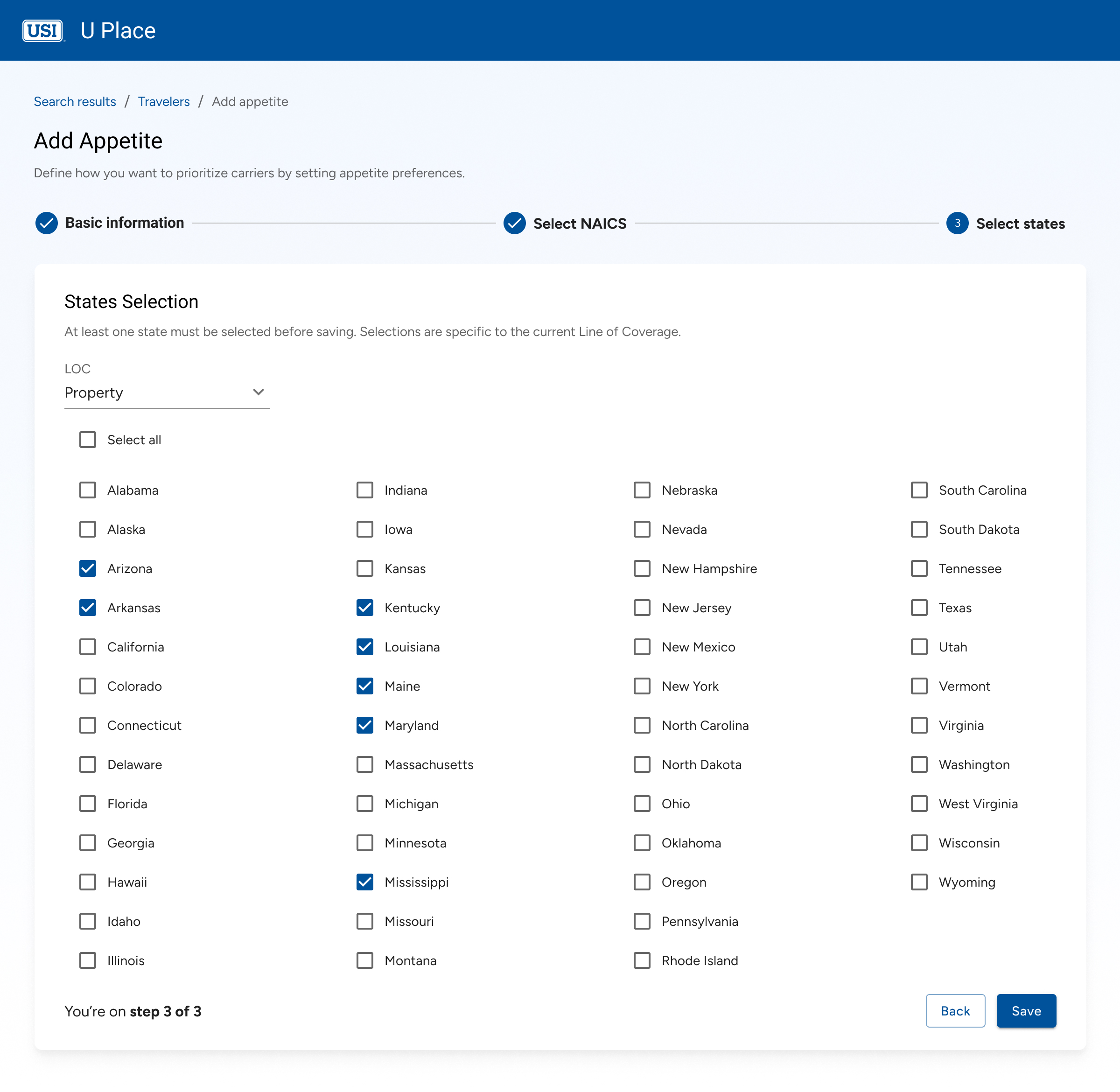
Users wanted flexibility to target overrides by both industry and geography.
To feel confident using the tool, users needed visibility into overrides and a clear way to track what had changed.
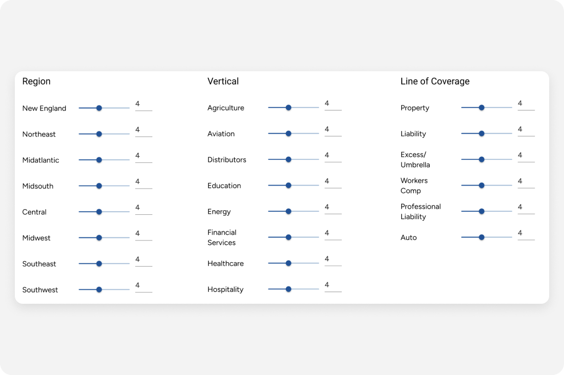
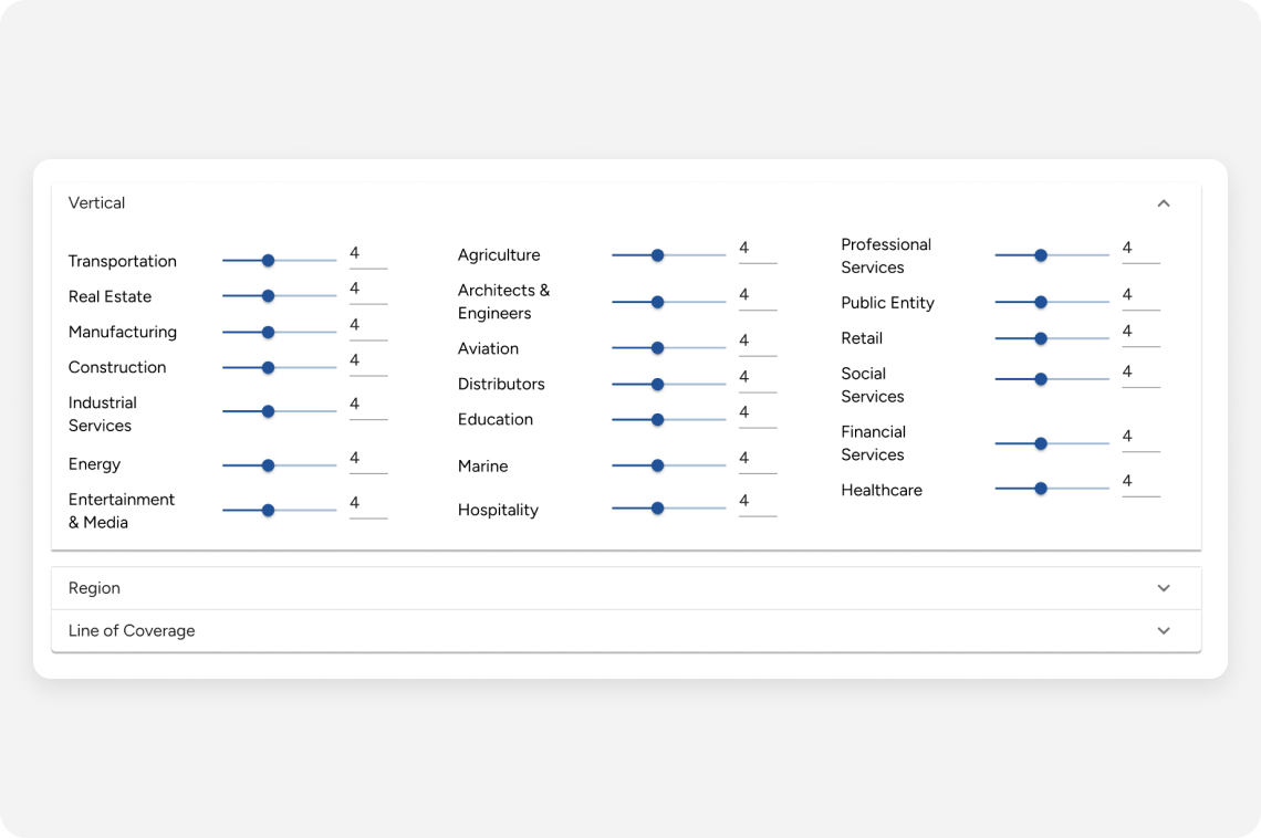
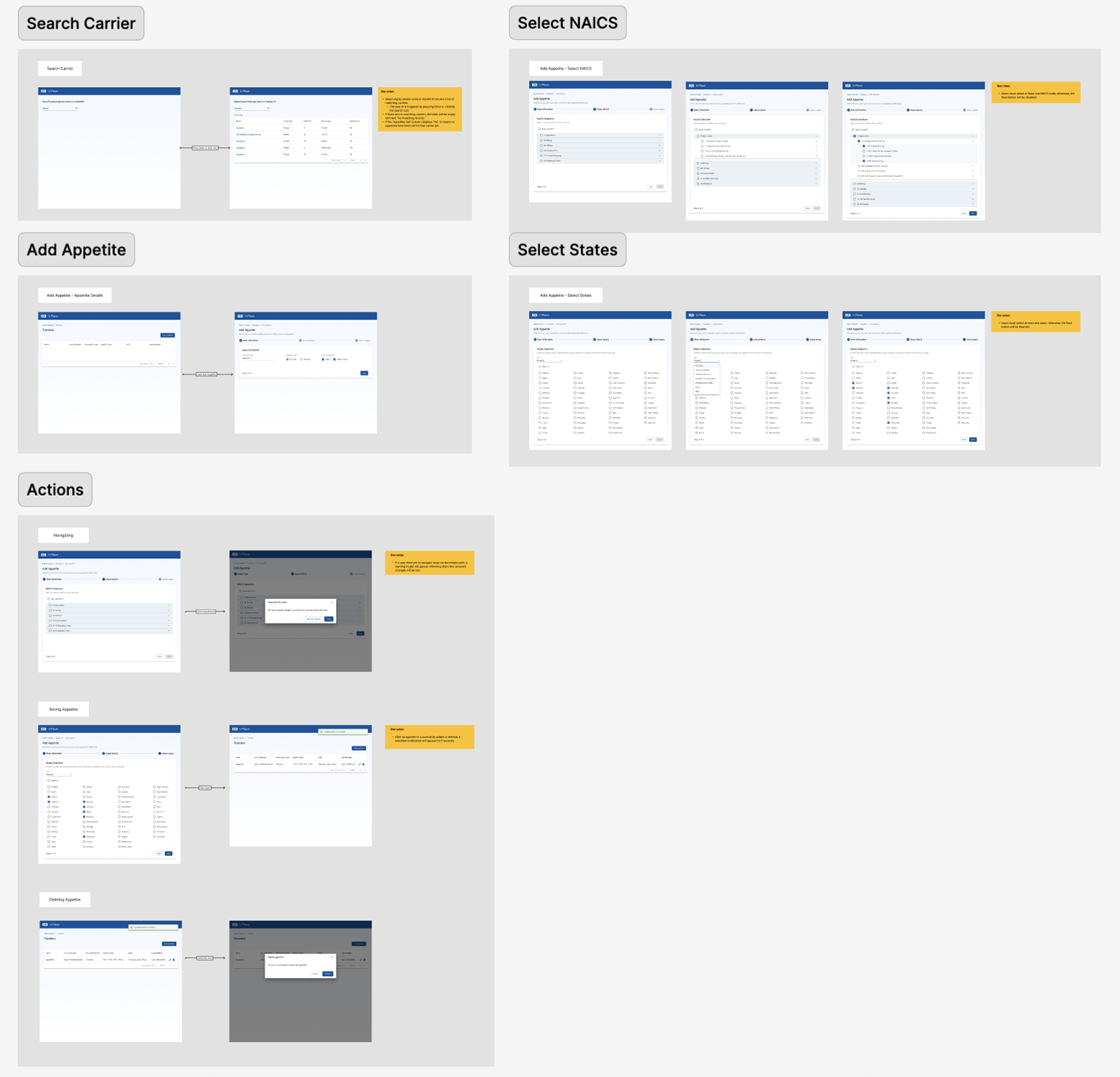
After defining the MVP, I explored two layout options to support carrier ranking: one with all sliders visible for a broad overview, and one with collapsible sections for focus. These early concepts helped clarify user priorities and shaped the design direction.
After presenting the initial wireframes, I received new feedback that shifted the design direction.
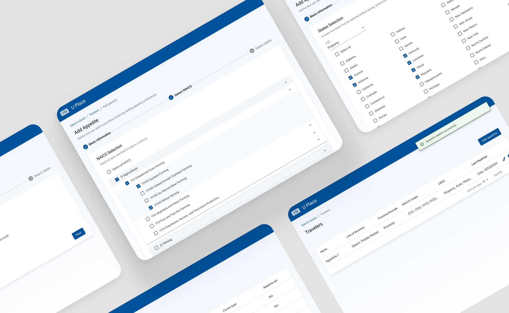
Replace sliders with promote/demote logic to streamline ranking decisions.
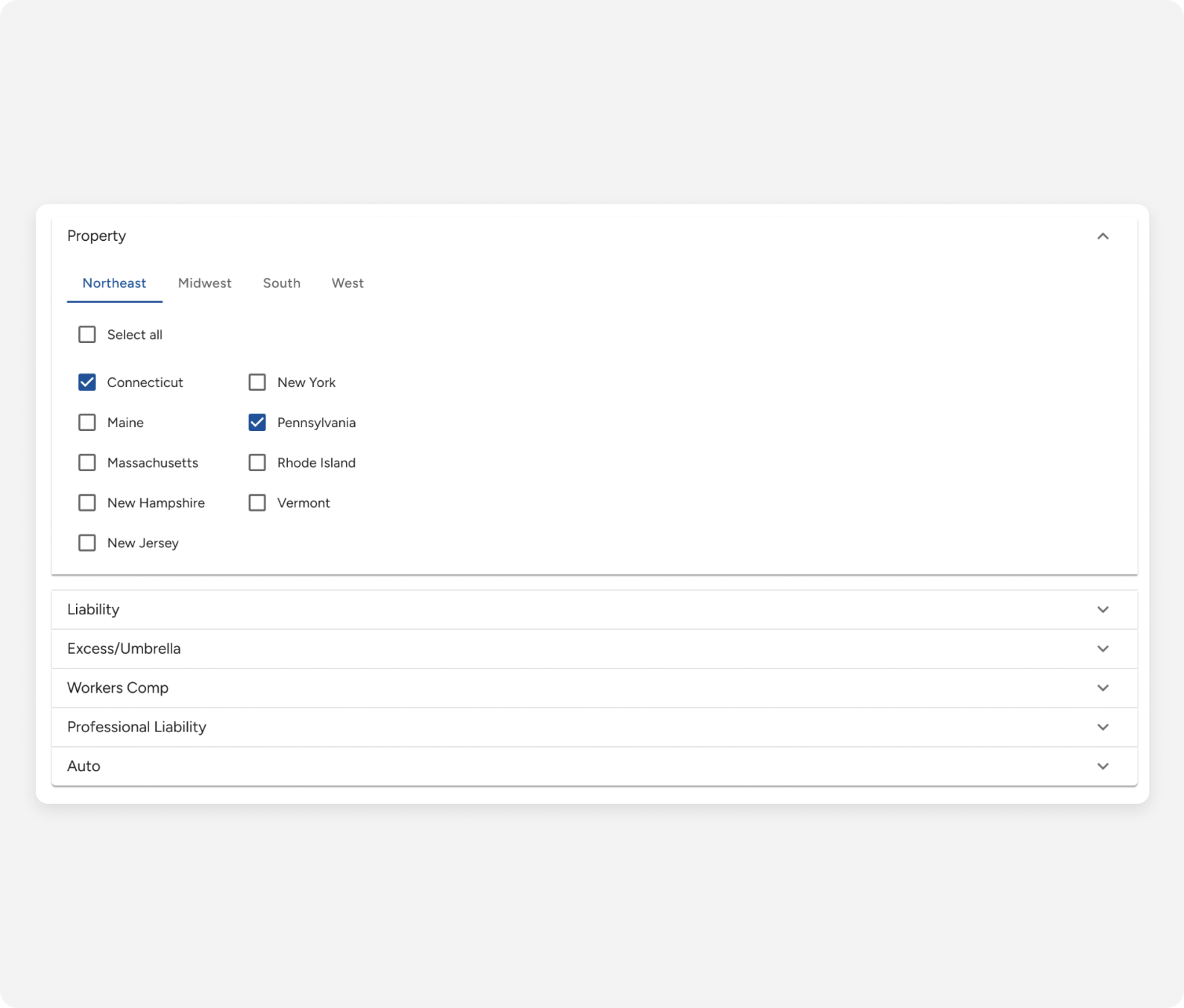
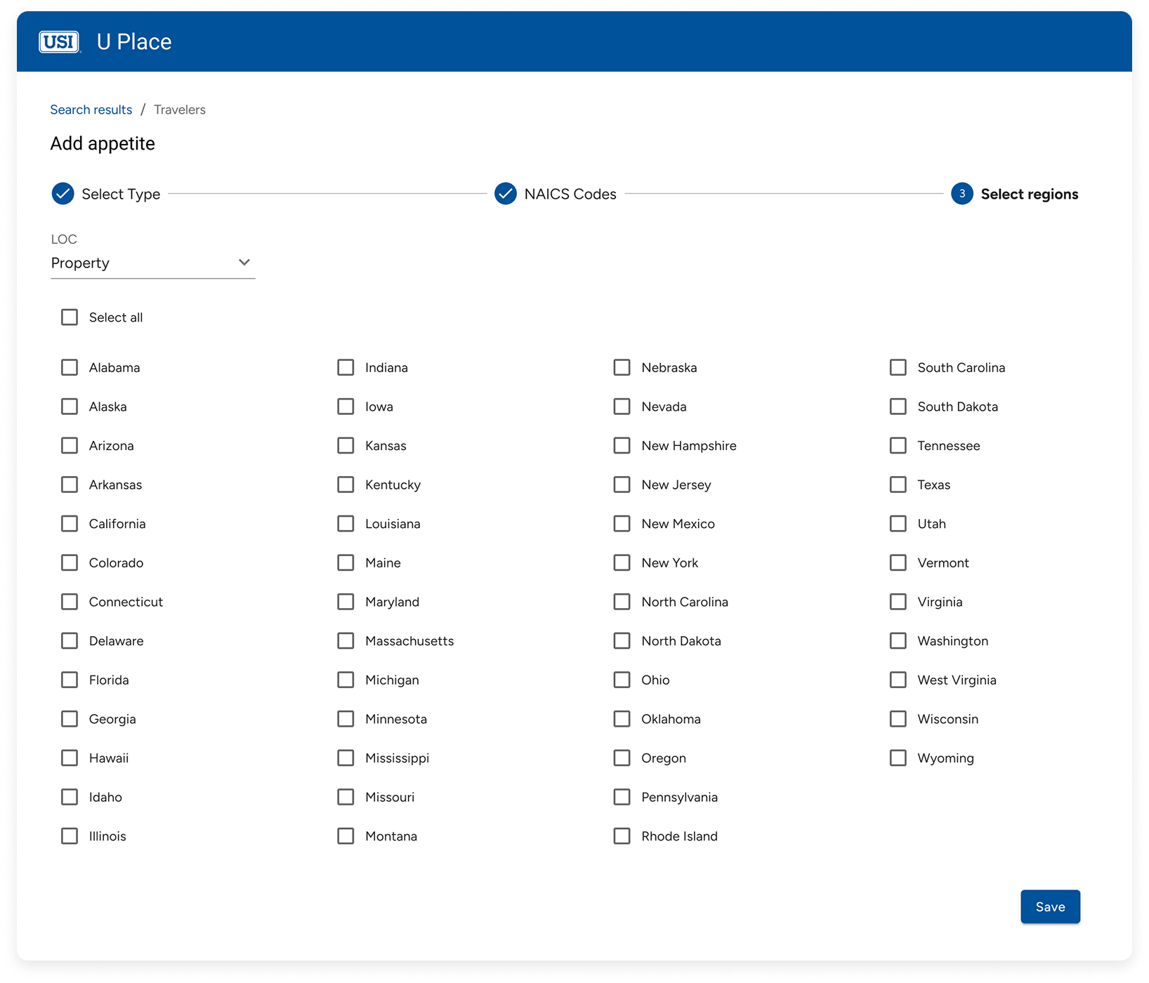
Shift from broad regions to individual states for greater precision.
Overrides were separated by line of coverage, reflecting how underwriters think.
I reworked the user flow to reflect updated needs—introducing promote/demote logic, NAICS targeting, and state-level overrides. This helped the team align on implementation and clarified the path for NAICS Code Selection and State Targeting.
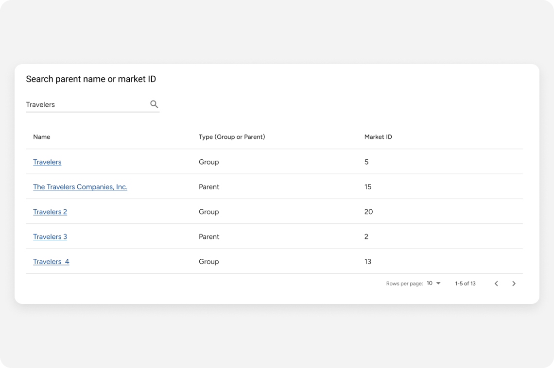
I tested the search-first interface with 4 internal users to validate usability.
I tested two options with 4 internal users: a searchable dropdown vs. region-based grouping.
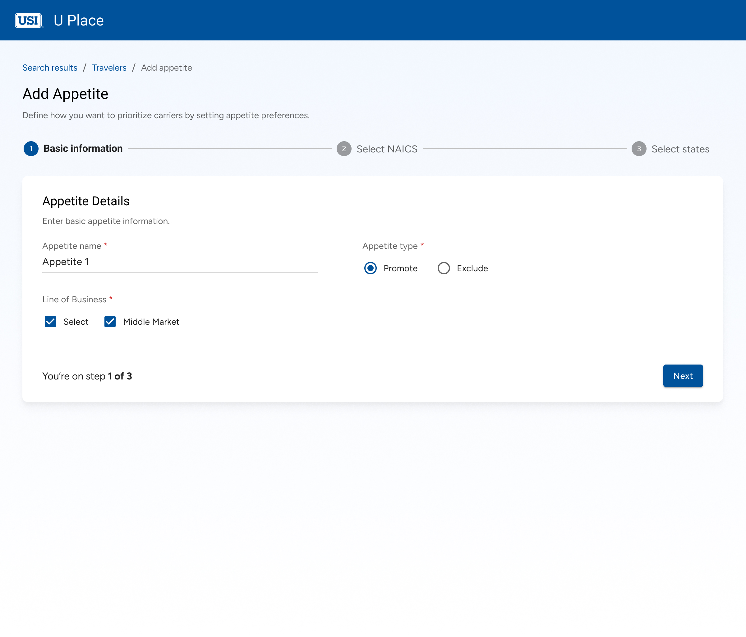
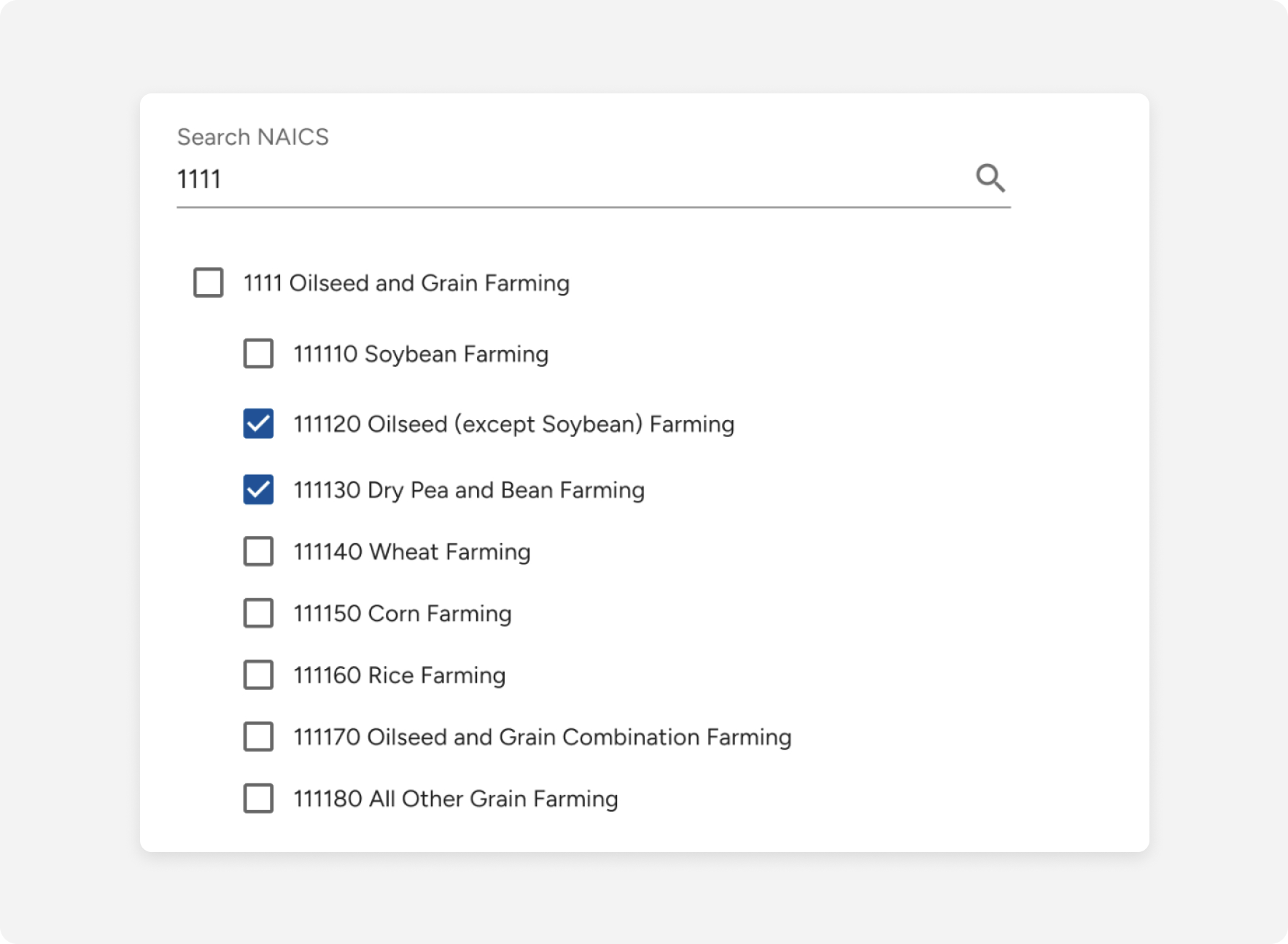
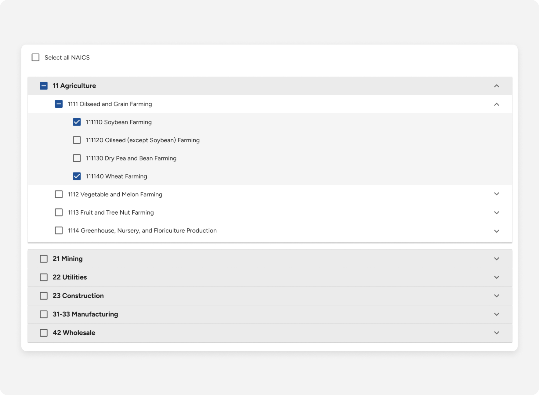
Capture appetite name, type, and line of business to define the goal.
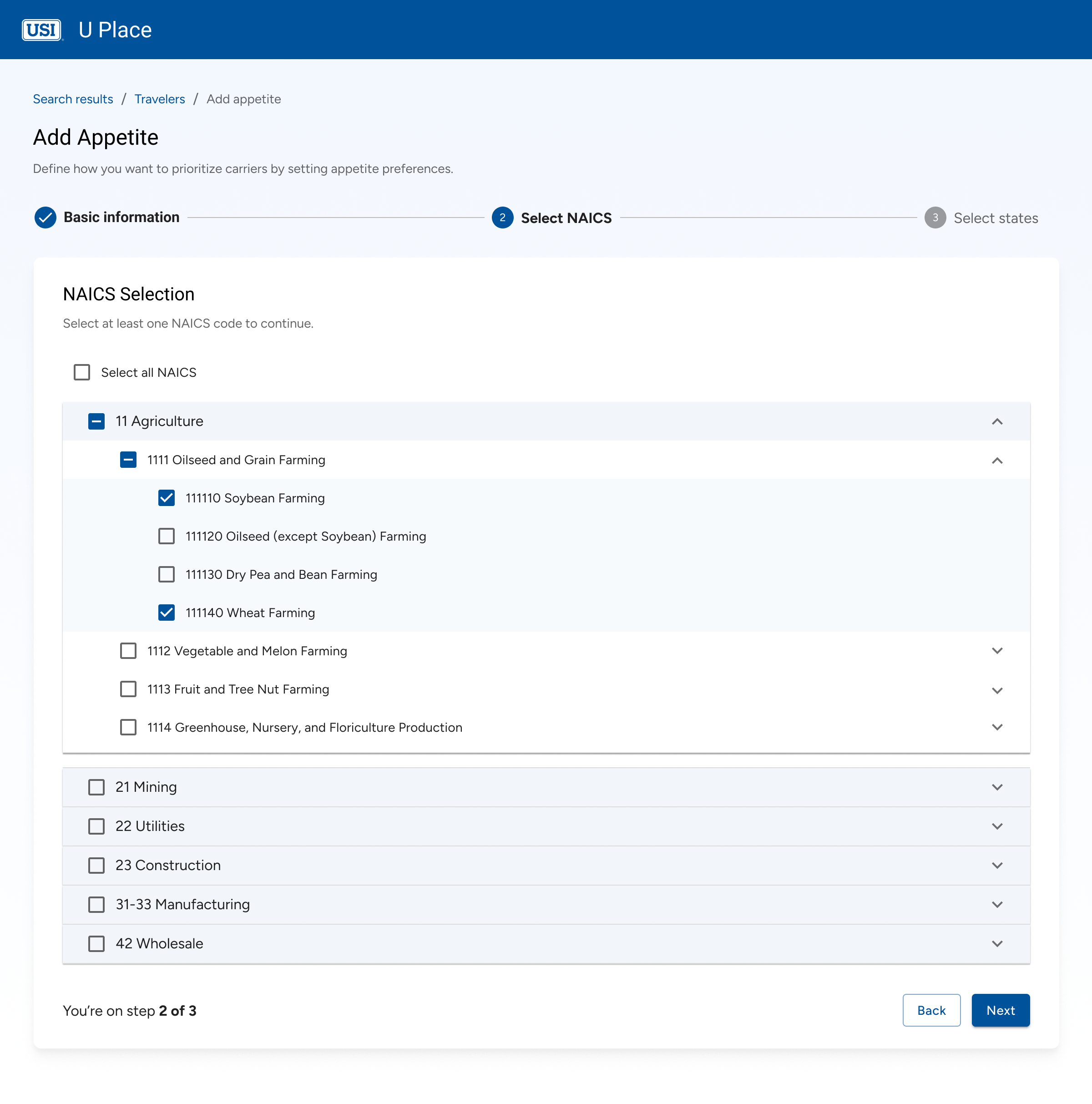
Expandable layout to scan and select multiple codes easily.
Flat checkbox layout with "Select All" for quick bulk action.
To build user confidence, I focused on clarity, feedback, and control. From step indicators and inline guidance to success confirmations and audit trails, every detail reinforces that the system is working as expected with no surprises.
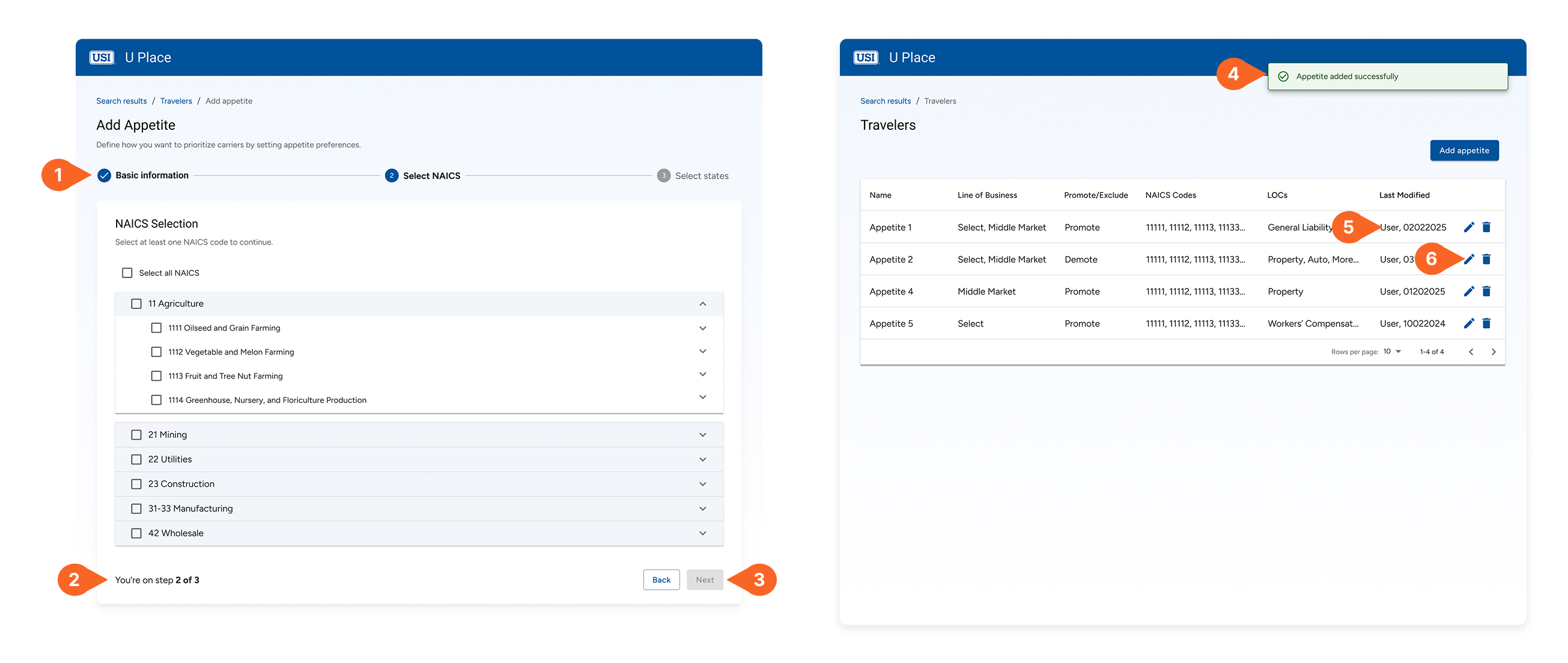
I created a clear, annotated handoff file that grouped screens by flow and highlighted key logic. Live walkthroughs with engineers helped resolve questions early and ensured smooth implementation with fewer surprises.

I created a clear, annotated handoff file that grouped screens by flow and highlighted key logic. Live walkthroughs with engineers helped resolve questions early and ensured smooth implementation with fewer surprises.
Launched MVP version of the product within 60 days of design hand-off.
Freed up developer time by removing manual override requests from their backlog.
All 4 internal users adopted the new workflow within the first two weeks.