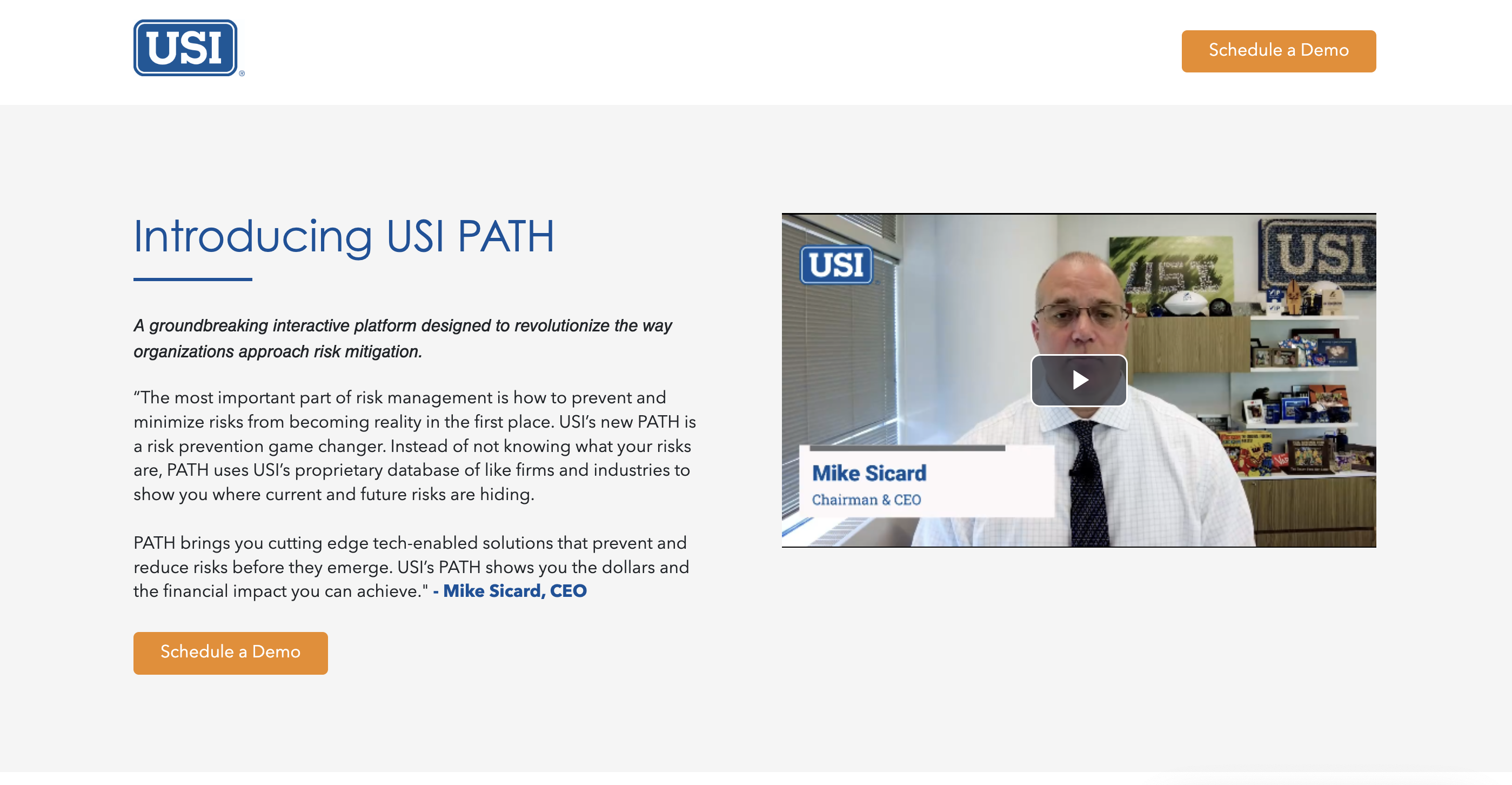
Path
Streamlining risk management with a customized, data-driven tool that identifies and addresses high-risk areas based on industry and company specifics.
Role
Lead UX Designer
Project Context
August 2023 - November 2023
Tools
Figma, Figjam
Overview
Problem
The challenge was to simplify complex and costly risk control strategies for organizations through PATH, addressing gaps in existing risk management programs. The platform needed to consolidate external-facing sales presentations with internal tools for producers, streamlining both aspects into a cohesive solution.
Solution
I enhanced the platform's usability by redesigning the navigation system, introducing a cleaner, hierarchical structure that reduced cognitive load.
Research and Insight
Stakeholder Q&A
Stakeholder interviews provided crucial insights that helped align the redesign with both business objectives and user needs, leading to a clear summary of key goals.
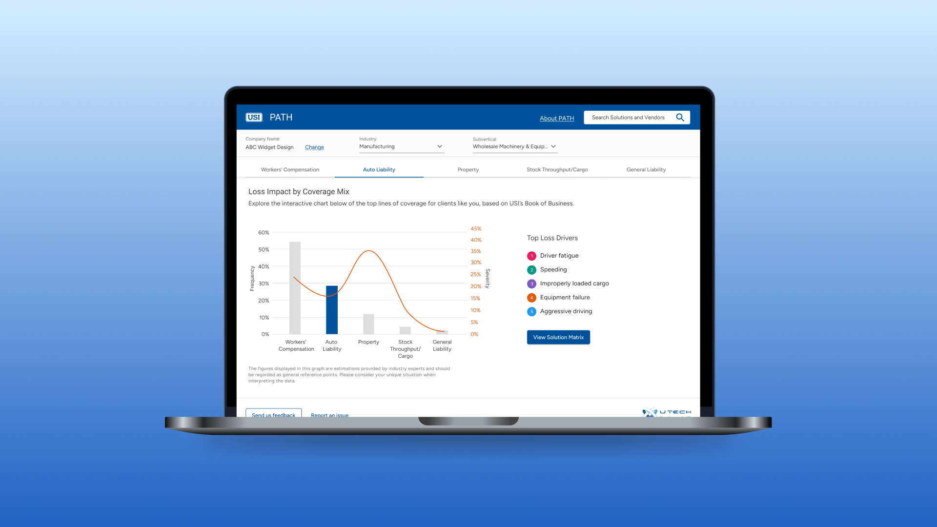
01. Customization and Personalization
The platform needs customization based on industry and company size.
02. Coverage Segmentation
Five distinct lines of coverage are essential for tailored solutions.
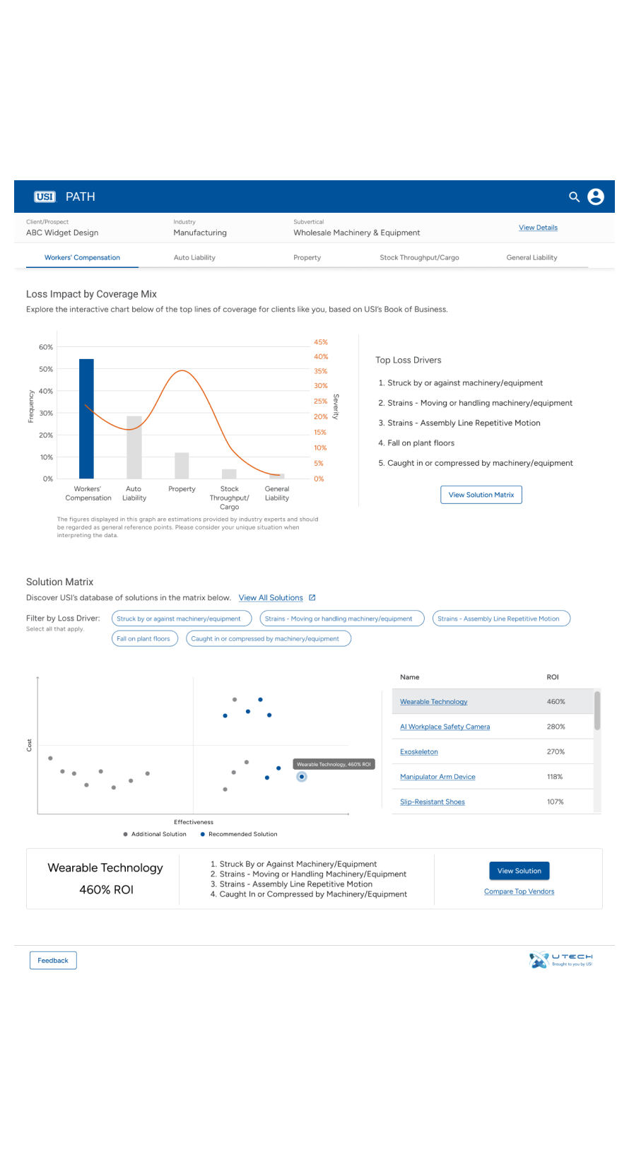
03. Solution Matrix
The solution matrix is a central, high-value feature of the platform.
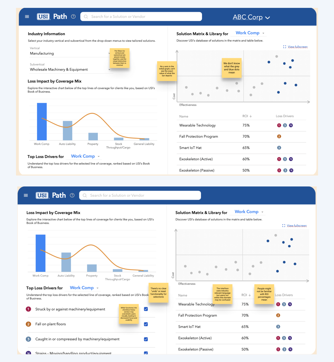
Heuristic Evaluation
I then conducted heuristic evaluation to uncover some key issues with the design.
1. Ambiguous Checkbox Labels and Filter Proximity: Violates Heuristic #4: Consistency and Standards and Heuristic #6: Recognition Rather Than Recall. The unclear checkbox labels and the close proximity of vertical and subvertical filters create confusion about what is being selected and filtered.
2. Interdependent Dropdowns Lacking Clarity: Violates Heuristic #5: Error Prevention and Heuristic #7: Flexibility and Efficiency of Use. The relationship between the two dropdowns is not clearly communicated, leading to potential confusion about how one selection impacts the other.
3. Cluttered Layout and Visual Overload: Violates Heuristic #8: Aesthetic and Minimalist Design. The crowded two-column layout and excessive checkboxes overwhelm users, making it harder to focus and navigate the interface.
Ideate and Design
Initial Wireframes
After conducting research, I quickly created a preliminary wireframe to kick off discussions. This rough draft effectively communicated my ideas and highlighted potential advantages and drawbacks. In a subsequent workshop of reviewing the wireframes, stakeholders confirmed that the vendor preview was unnecessary and expressed a preference for a more prominent solution matrix. They appreciated the comprehensive list of loss drivers, as it allowed them to easily compare all solutions at once.
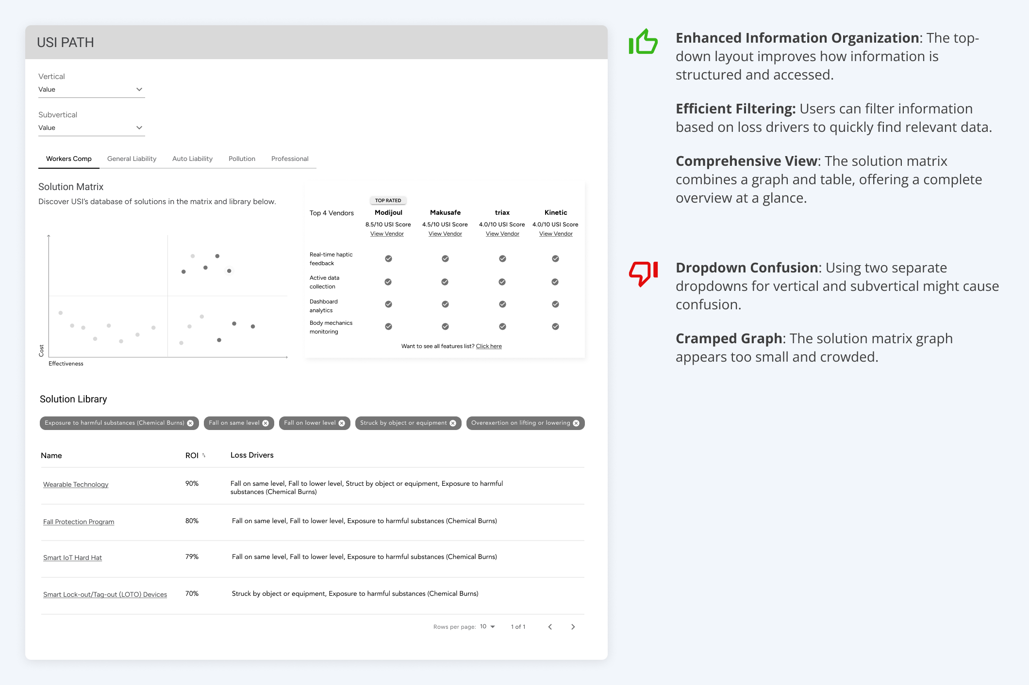
Solution Matrix Iteration
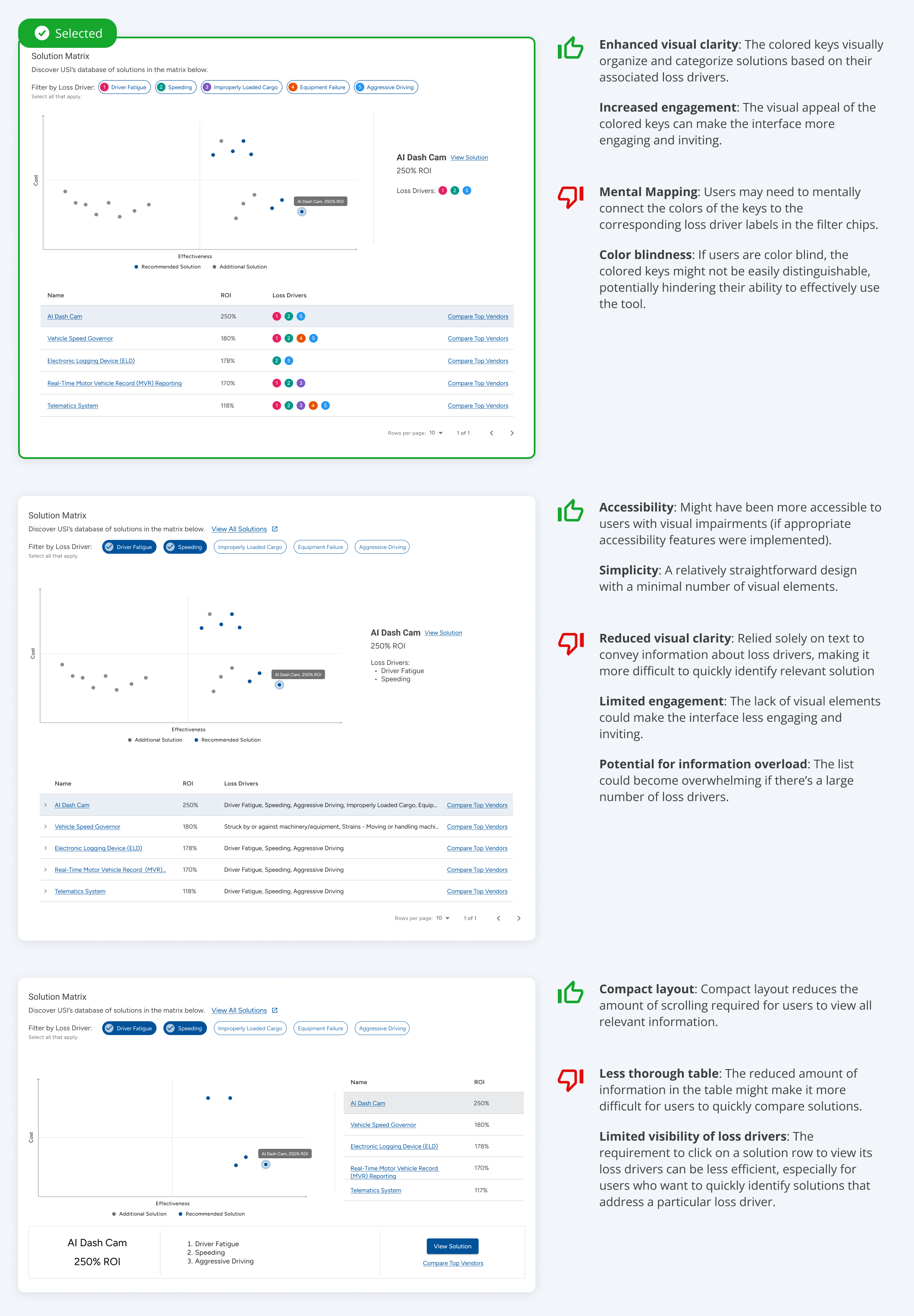
After receiving feedback from stakeholders, I further iterated on the wireframes while also implementing some visual design elements. For all the iterations, the vendor comparison preview table has been omitted.
Improving Data Navigation
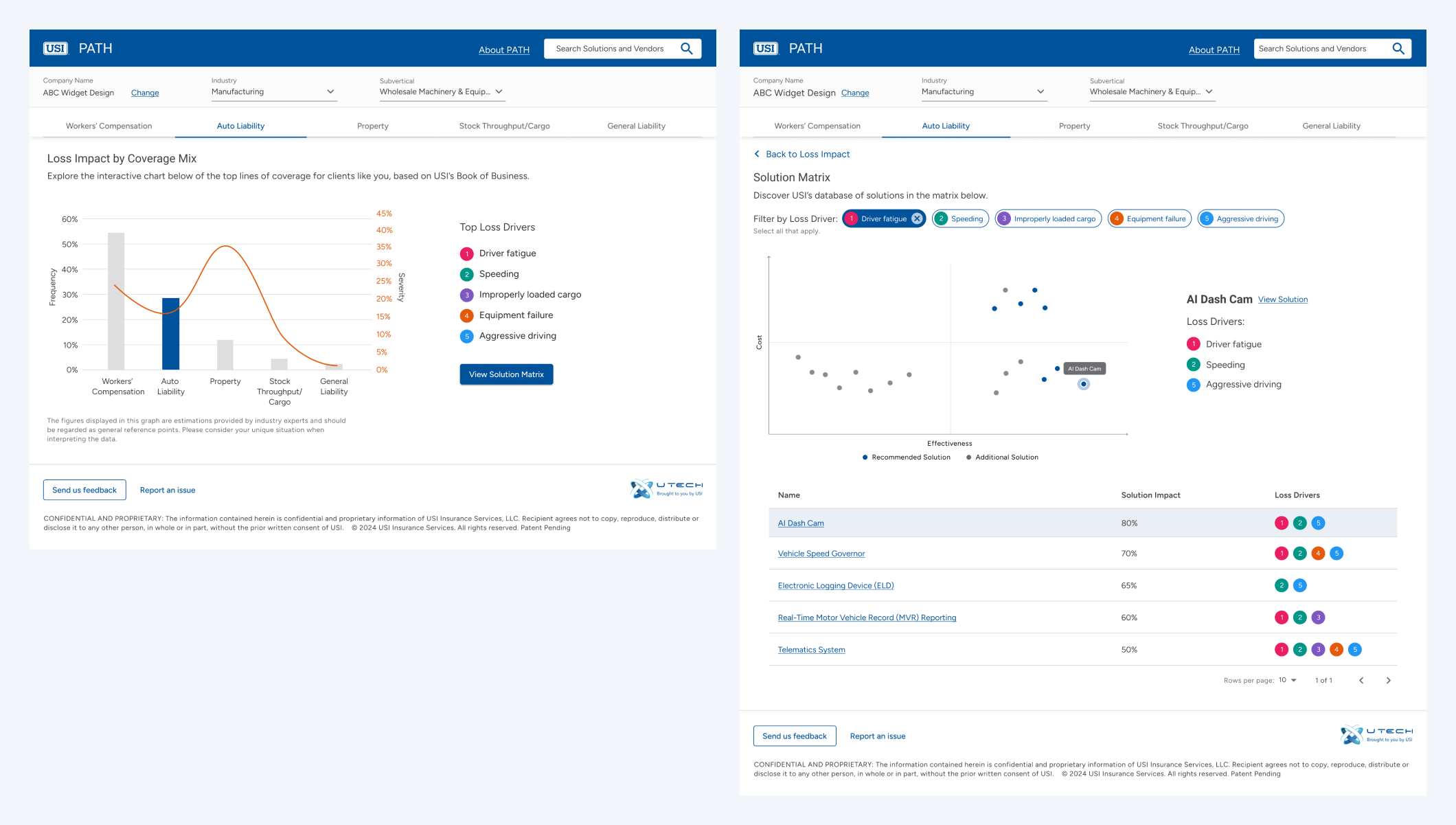
The initial design relied solely on dropdowns for data selection, which was confusing and lacked a clear hierarchy. To address these limitations, I implemented a dual approach: a top-level filter using dropdowns and the introduction of navigation tabs.
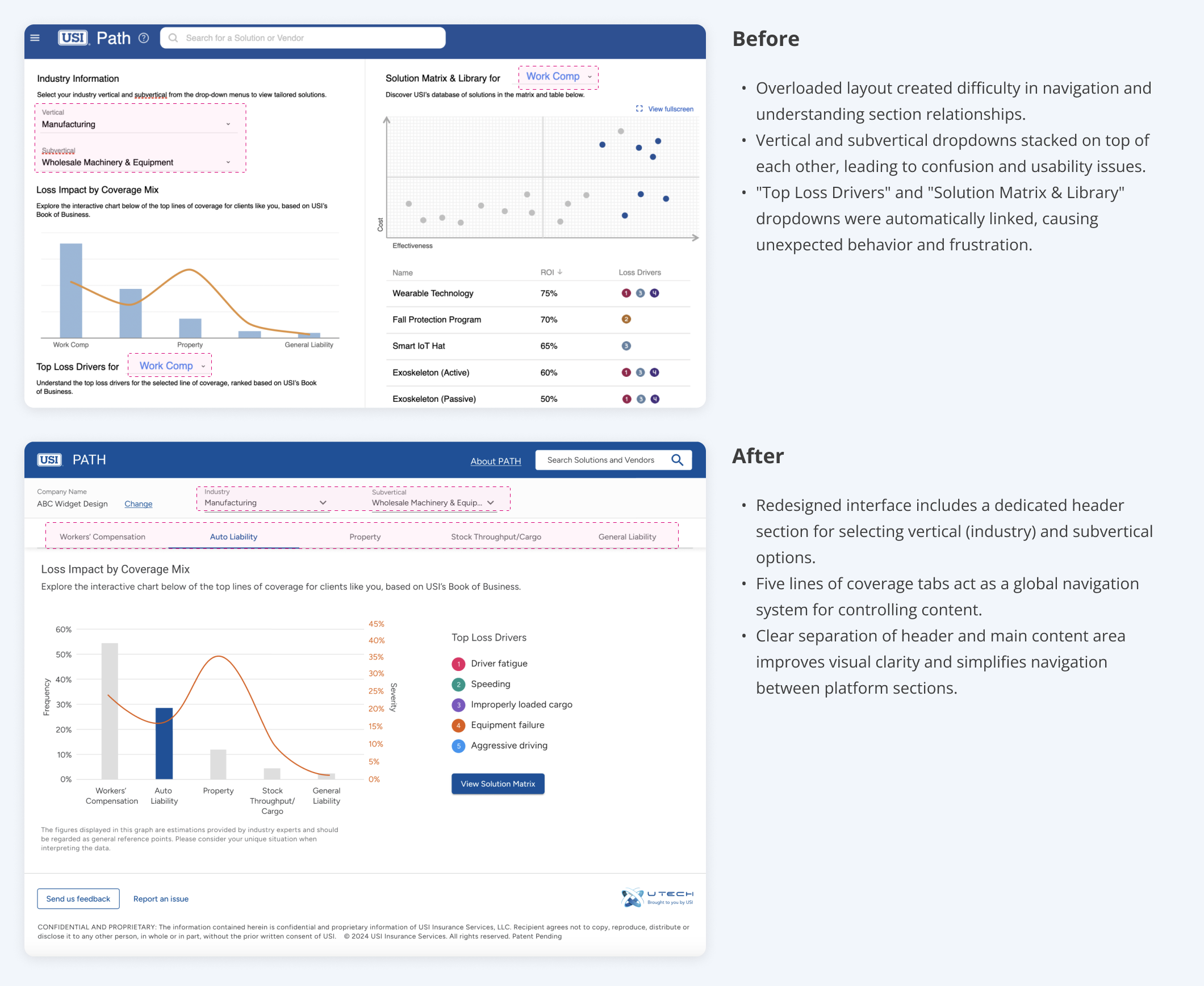
Reducing Cognitive Overload
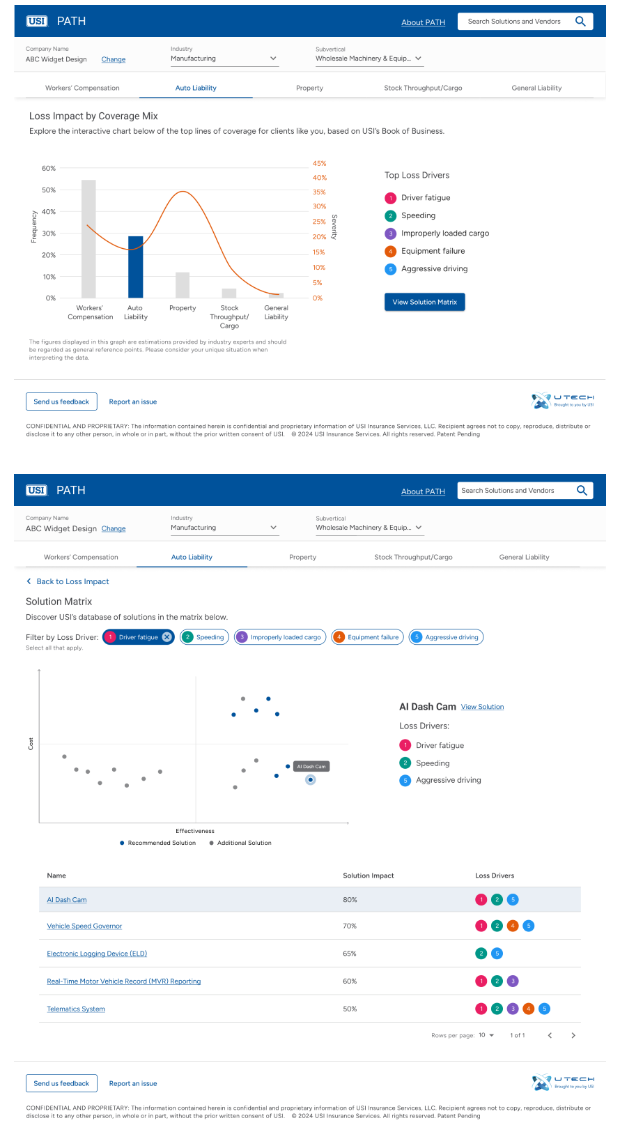
I separated the ‘Loss Impact’ and ‘Solution Matrix’ sections into distinct pages. Dedicated buttons now allow users to easily switch between these sections. This decision was based on stakeholder feedback, recognizing that for many users, the ‘Loss Impact’ graph serves primarily as an introductory visual, while the ‘Solution Matrix’ is the primary focus. Additionally, expanding the ‘Solution Matrix’ table required more real estate, making it more suitable for a dedicated page. This reorganization not only improved platform performance by reducing the amount of content loaded at once but also enhanced future scalability, ensuring the 'Solution Matrix' can effectively accommodate growth in complexity.
Before
Clicking on "View solution matrix" would scroll the user to the bottom of the page to access the solution matrix table.
After
Clicking on "View solution matrix" now navigates the user to a dedicated section featuring the solution matrix and the table. Users can easily return to the previous page by clicking the "Back to Loss Impact" button located in the top left corner.
Development and Outcomes
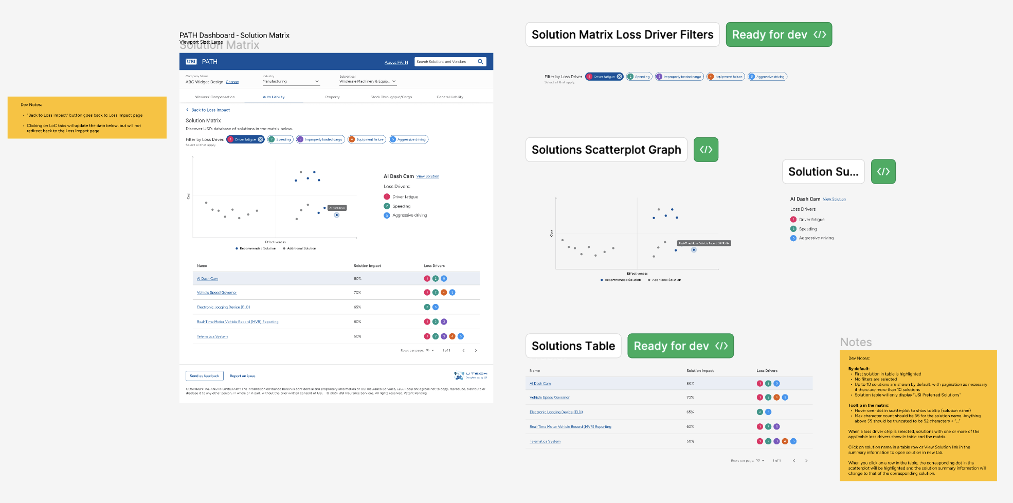
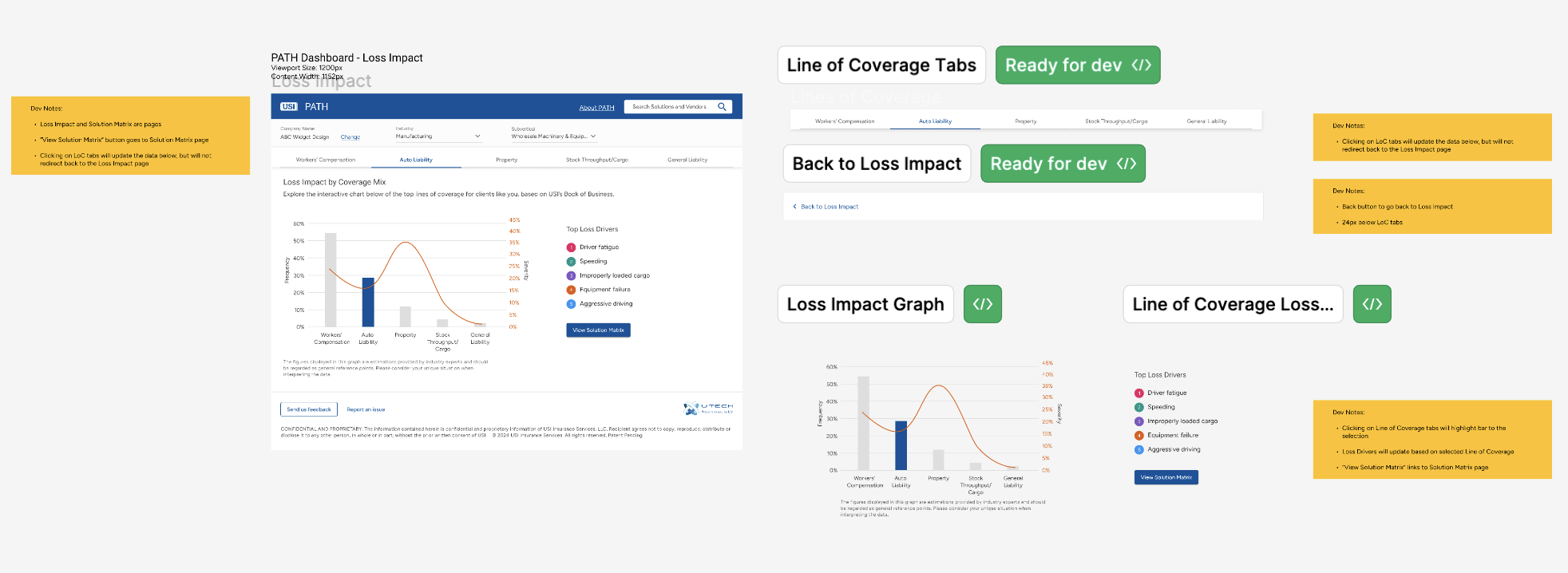
Development Handoff
Below are detailed development notes to ensure the thorough execution of designs according to specifications. These notes provide clear explanations for implementing interactive elements, ensuring accurate execution of the design.
Outcomes
The USI PATH platform has demonstrated strong user engagement and adoption since its launch.
1. Positive Adoption Rates: The producer adoption rate average amongst regions is 33.61%, demonstrating strong user acceptance and utilization.
2. Increased User Engagement: The platform has seen a steady increase in active users, with a 31.77% increase in total sessions and a 69.27% increase in unique users.