Stakeholder interviews provided crucial insights that helped align the redesign with both business objectives and user needs, leading to a clear summary of key goals.
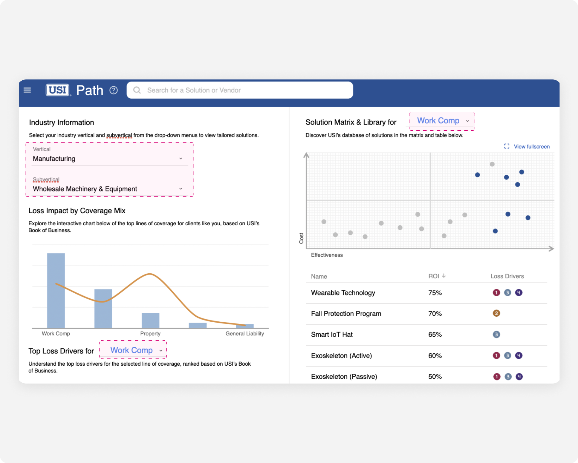
The platform needs customization based on industry and company size.
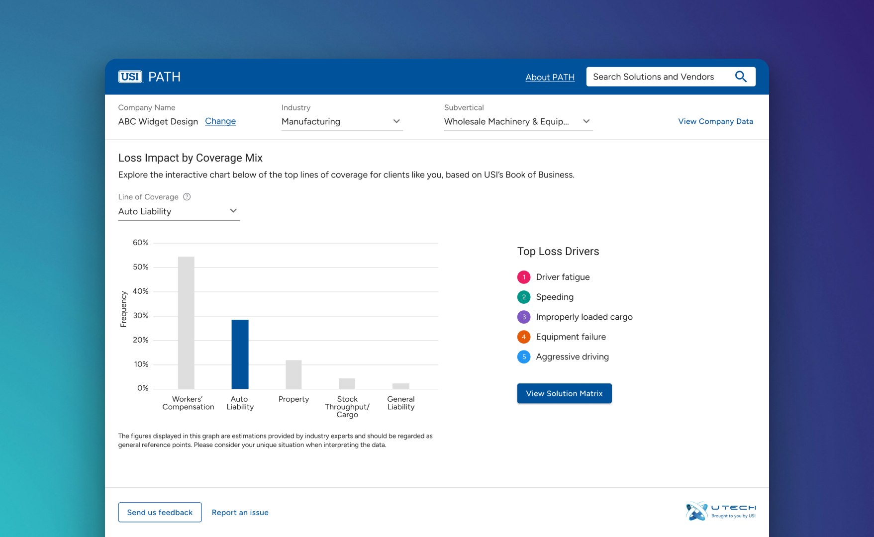
Five distinct lines of coverage are essential for tailored solutions.
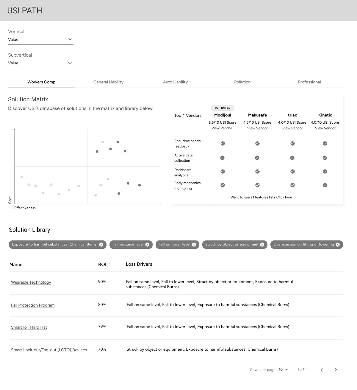
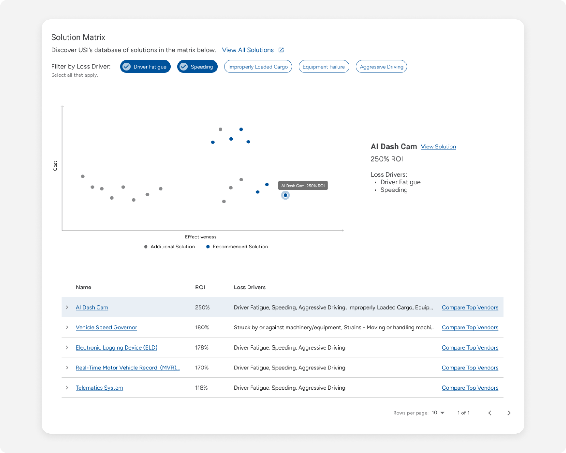
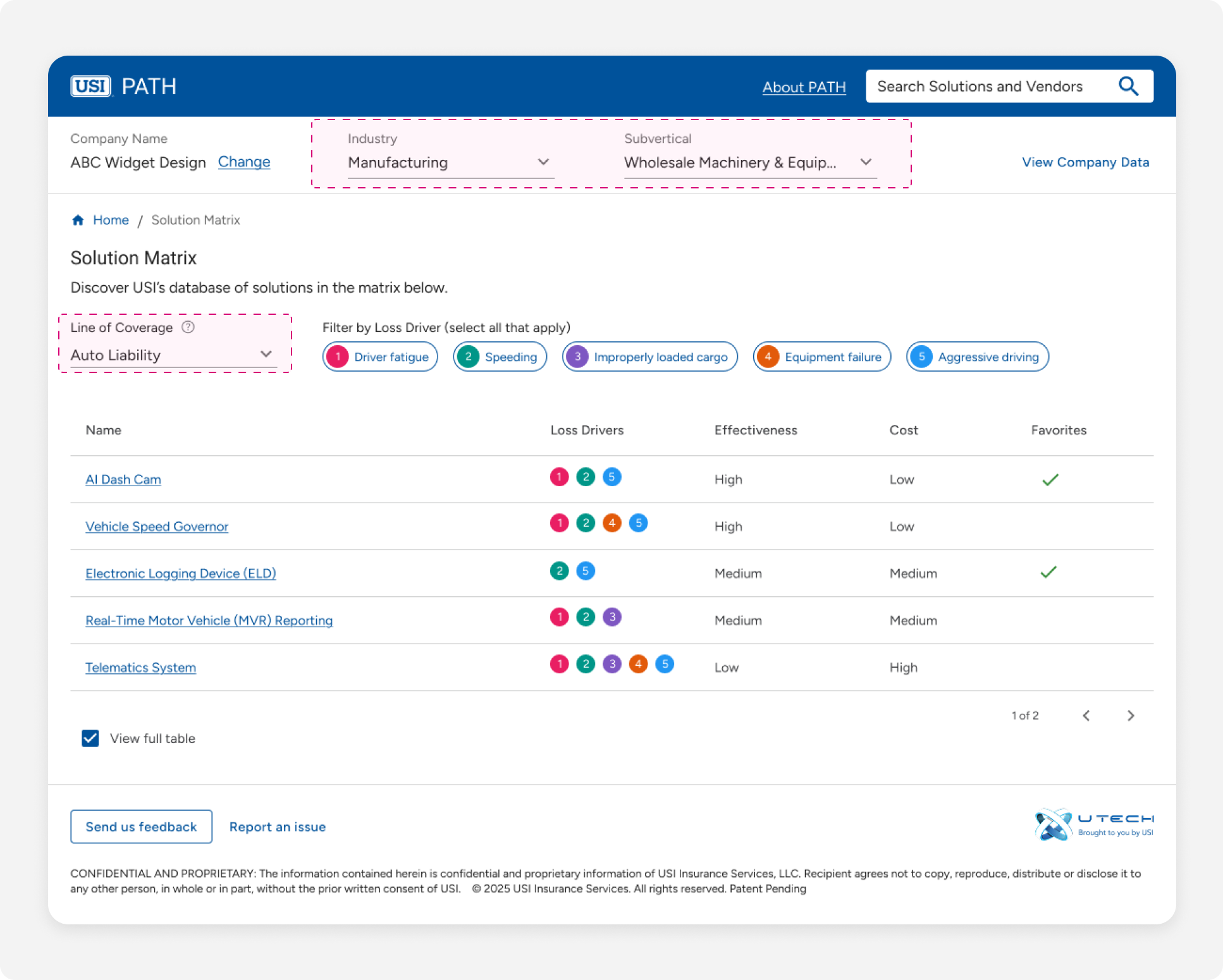
The solution matrix is a central, high-value feature of the platform.
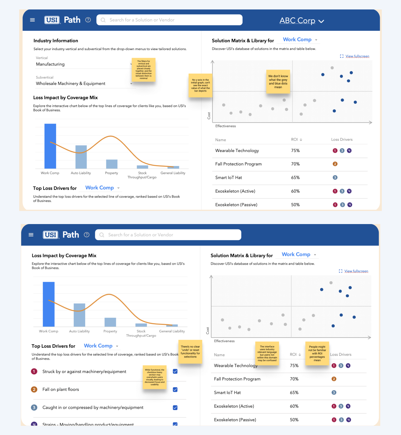
The unclear checkbox labels and the close proximity of vertical and subvertical filters create confusion about what is being selected and filtered.
The relationship between the two dropdowns is not clearly communicated, leading to potential confusion about how one selection impacts the other.
The crowded two-column layout and excessive checkboxes overwhelm users, making it harder to focus and navigate the interface.
I created a quick wireframe to spark discussion. In a subsequent workshop, stakeholders confirmed that the vendor preview was unnecessary and expressed a preference for a more prominent solution matrix.
After receiving feedback from stakeholders, I further iterated on the wireframes while also implementing some visual design elements. For all the iterations, the vendor comparison preview table has been omitted.
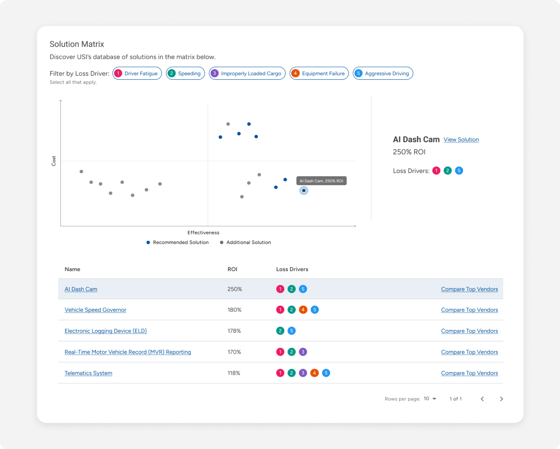
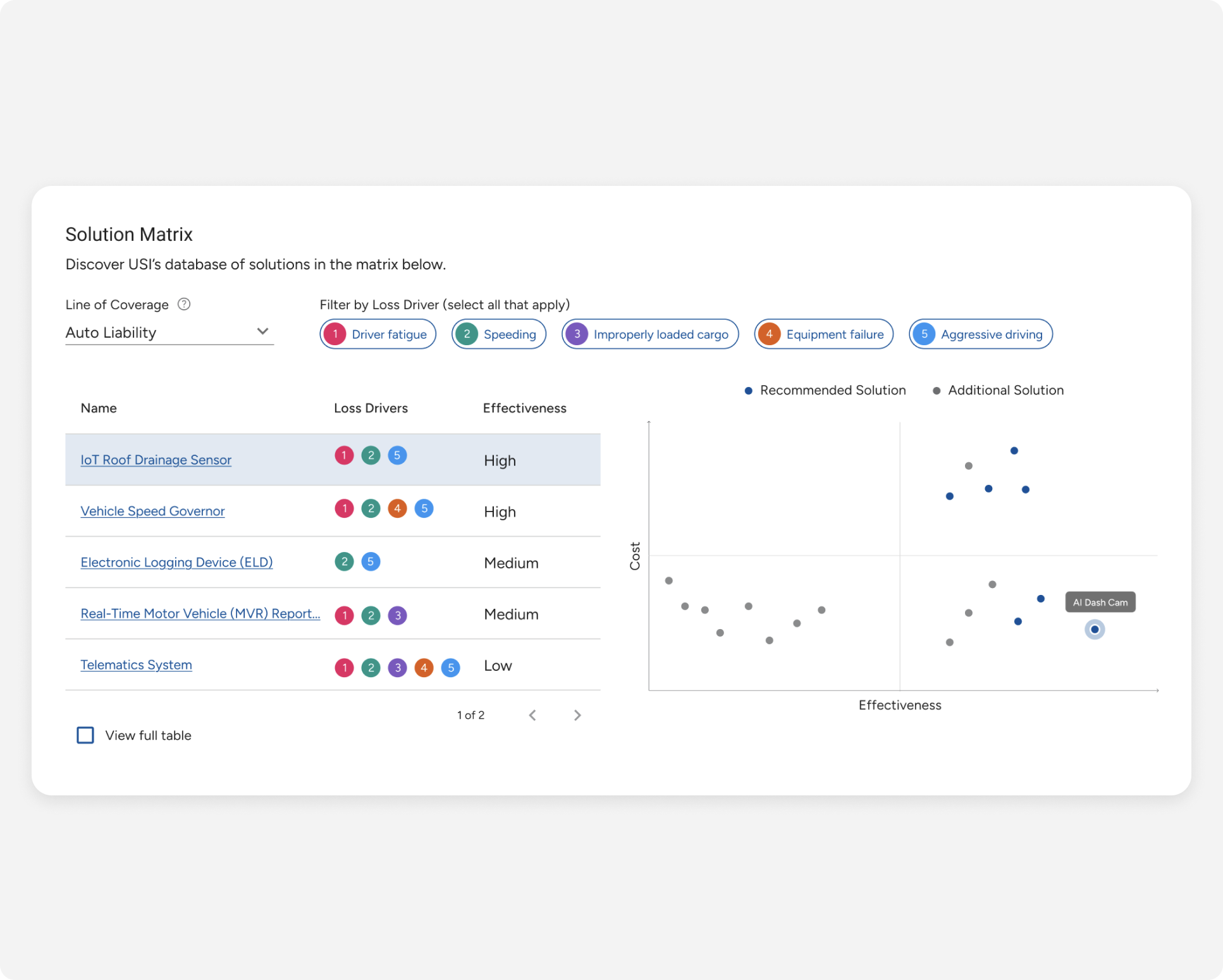
The initial design relied solely on dropdowns for data selection, which was confusing and lacked a clear hierarchy. To address these limitations, I implemented a dual approach: a top-level filter using dropdowns and the introduction of navigation tabs.
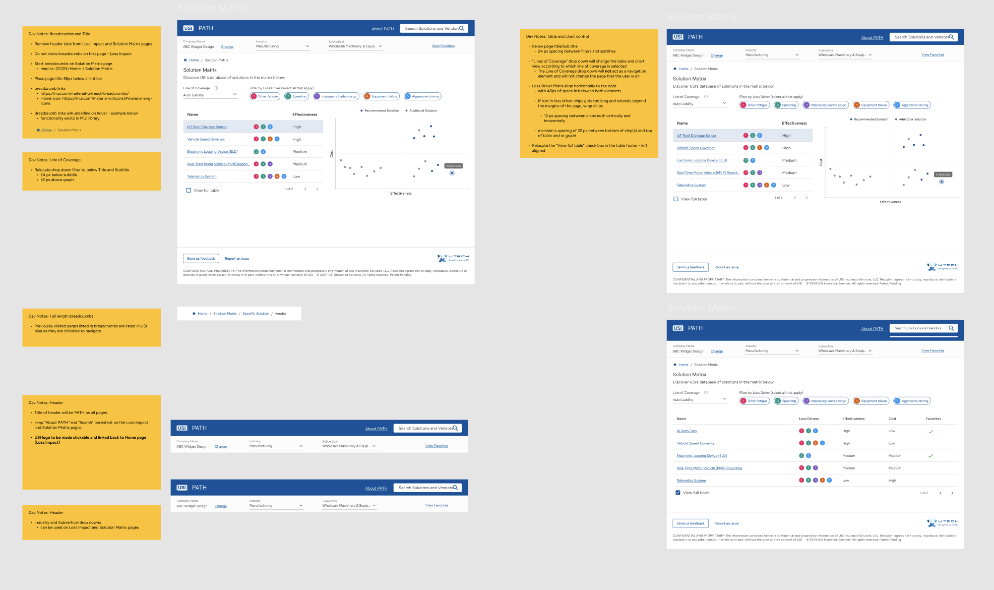
The developers notes provided clear explanations for implementing interactive elements, ensuring accurate execution of the design.
Producer adoption across regions indicates strong platform traction and early success.
A sharp rise in new users signals growing engagement and awareness.
Returning users are actively engaging with the platform to explore risk insights and solutions.