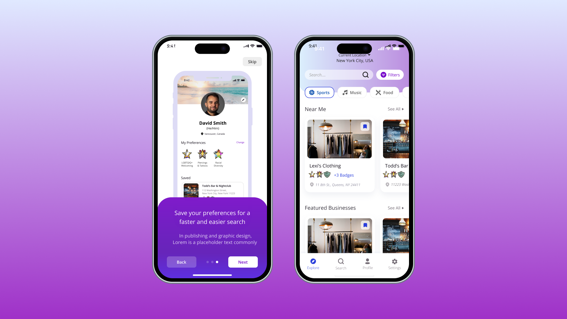
Sequeer
Making discovering LGBTQ businesses easy.
Role
Lead UX Designer
Project Context
August 2021 - November 2021
Team: CEO, Project Manager, 2 Designers
Tools
Figma, Figjam, Miro
Problem
Originally developed by an external tech company, SEqueer faced challenges during the development process, particularly due to communication issues. This resulted in an app and website that are not simple or clean, ultimately leading to user drop-off. The company's new partner and creative director noted that the current UX/UI lacks the necessary simplicity and accessibility, which is crucial for engaging users and ensuring an inclusive experience.
Solution
We conducted a thorough heuristic evaluation to identify user pain points and areas for improvement. The app was then redesigned to address these issues and included new features, such as the addition of a review function.
Stakeholder Q&A
In our stakeholder meeting, we identified three core objectives to guide the design direction.
01. Visual Identity
Incorporate neon accents and a lighter color theme for a modern, vibrant look.
02. Map Functionality
Improve the map feature to support queer-owned businesses, similar to Google Maps.
03. Design Inspiration from Popular Apps
Draw inspiration from popular apps to meet contemporary user expectations.
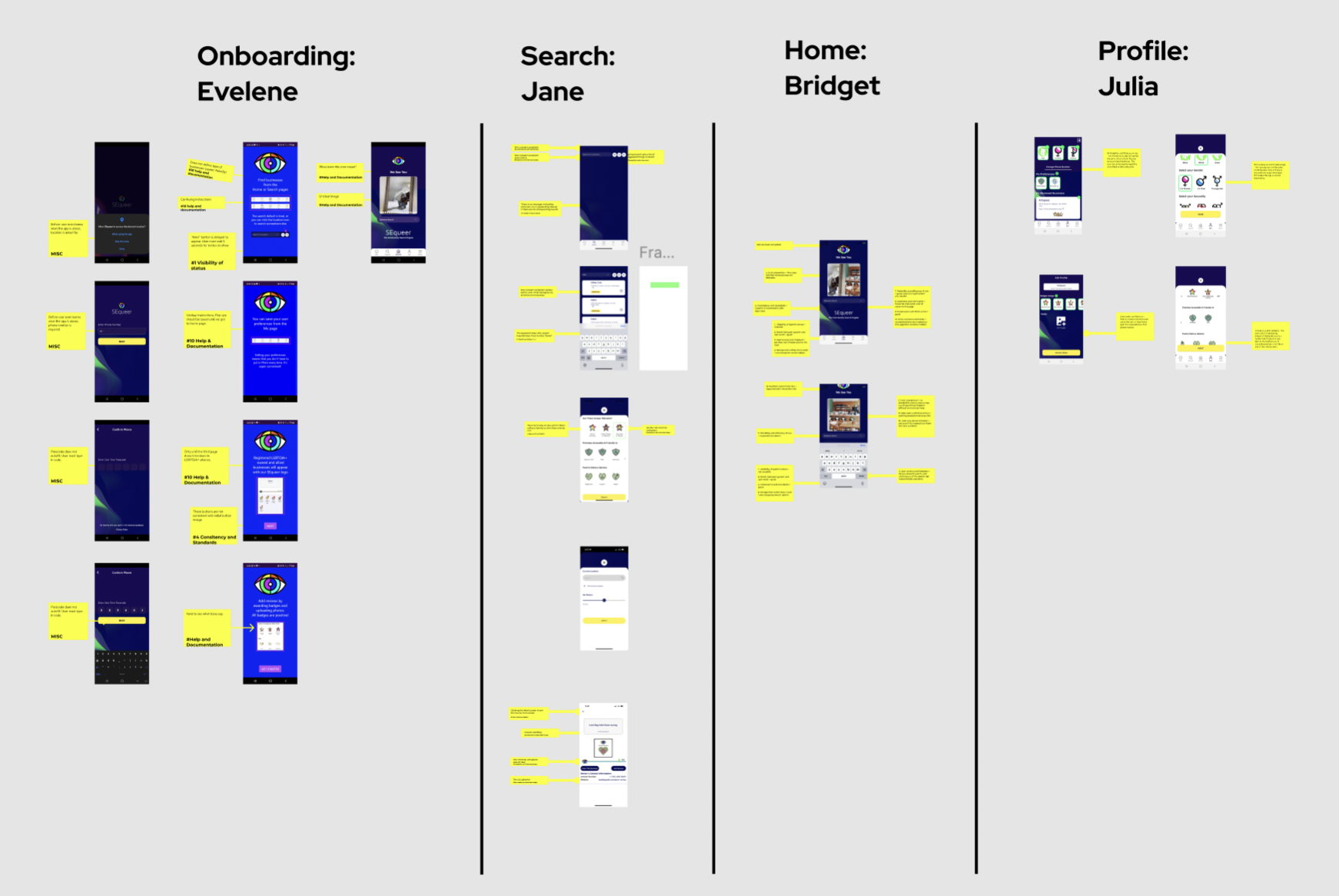
Heuristic Evaluation
We conducted a comprehensive analysis to identify areas requiring improvement. Our evaluation revealed several key issues:
1. Color Contrast: Low color contrast made text difficult to read, particularly for users with visual impairments.
2. Visibility of System Status: Lack of feedback on system status caused user confusion and uncertainty about actions.
3. Inconsistent Calls to Action (CTAs): The calls to action were inconsistent in both design and wording, causing ambiguity and reducing overall usability.
4. Lack of User Control and Freedom: The app limited user control, offering few options for undoing actions or navigating freely between steps.
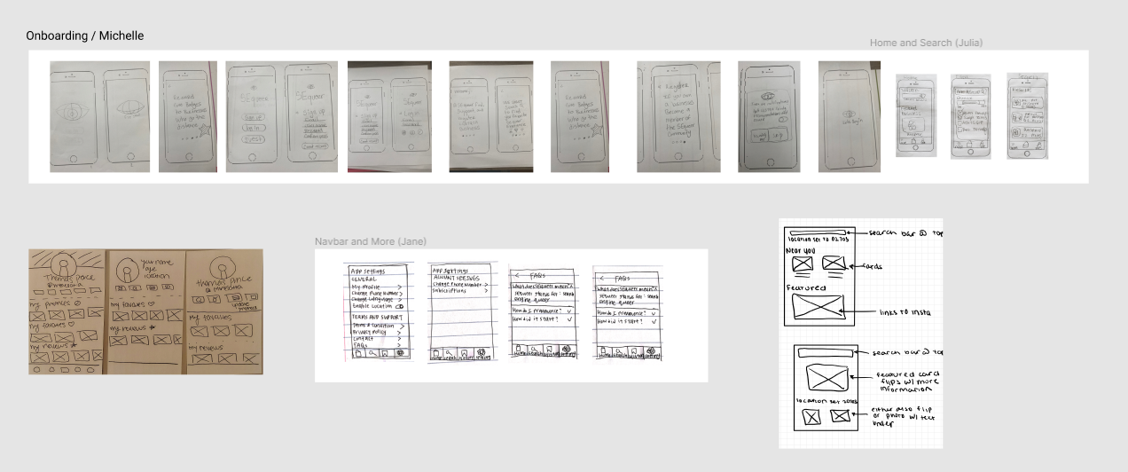
Sketches
Sketching allowed us to efficiently brainstorm and refine ideas. Each team member contributed by sketching key sections, including the main dashboard, badge system, and search filters. This collaborative approach ensured we addressed all design aspects early on, incorporating diverse perspectives and resolving potential issues before advancing to high fidelity wireframes.
Low Fidelity Wireframes
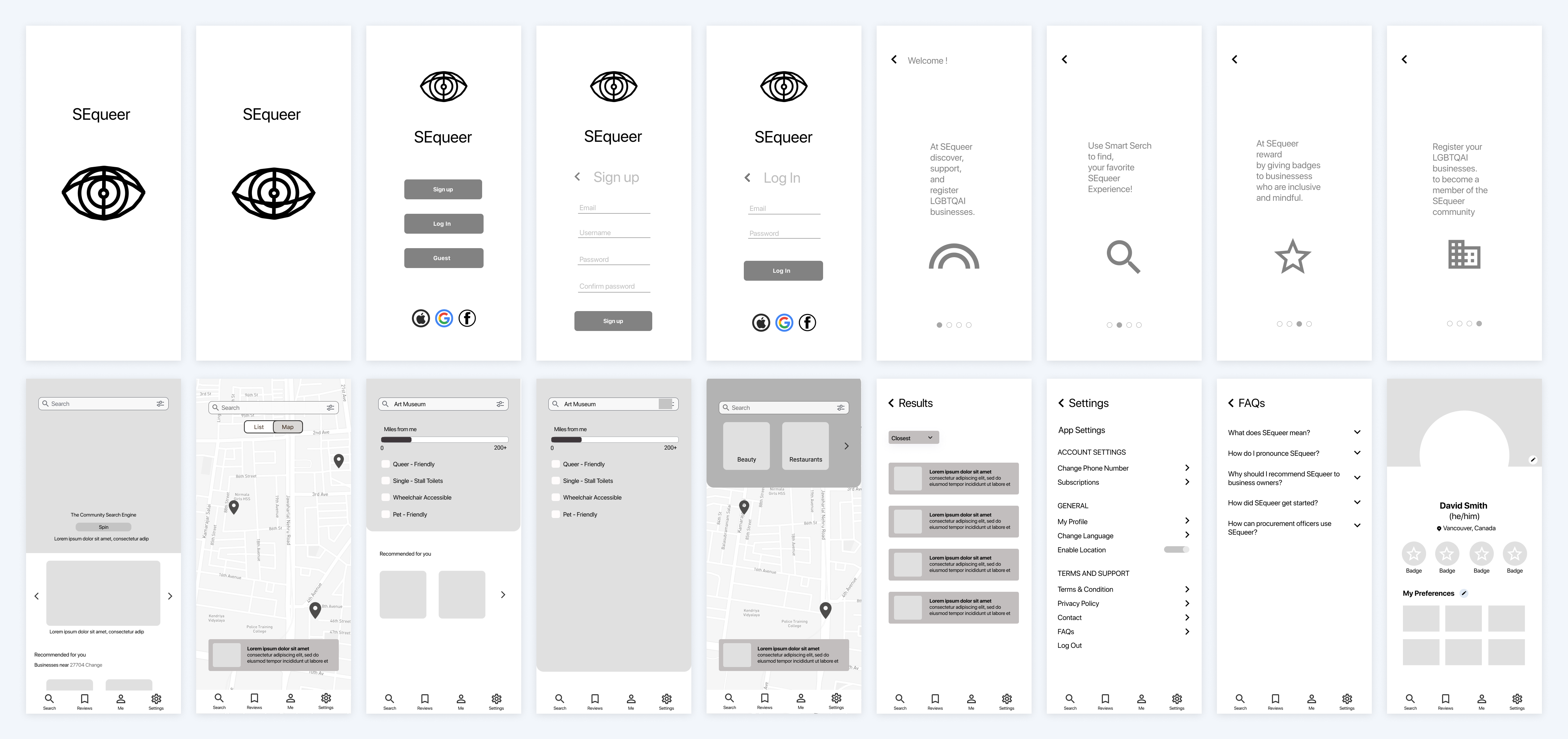
After finalizing the app’s layout through sketches, we moved to low-fidelity wireframes, focusing on navigation, button placement, and content organization. A key decision was balancing list and map views for displaying nearby businesses. The list catered to users seeking details, while the map helped those navigating by proximity. This dual view enhanced usability and made the app adaptable to diverse user needs.
High Fidelity Iterations: Onboarding
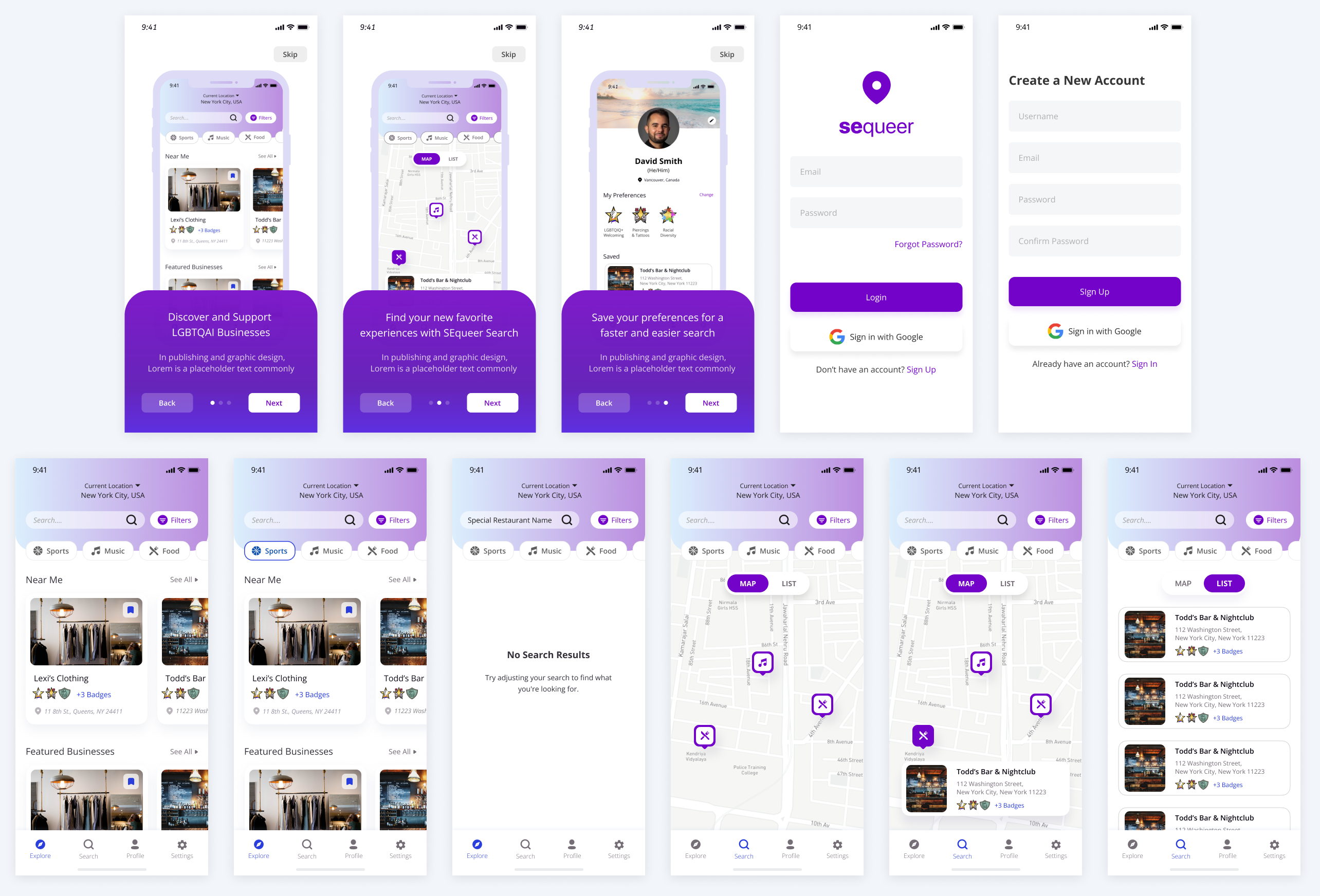
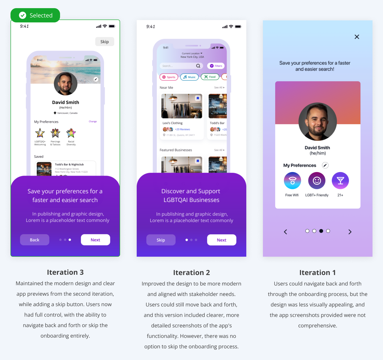
I iterated on the app's onboarding screens to improve flexibility. Initially, users couldn't skip onboarding, which felt restrictive. In the second iteration, I added a cleaner design, comprehensive screenshots, and a skip option. For the third and final iteration, I introduced back-and-forth navigation, giving users more control and enhancing the onboarding experience.
High Fidelity Iterations: Home Screen
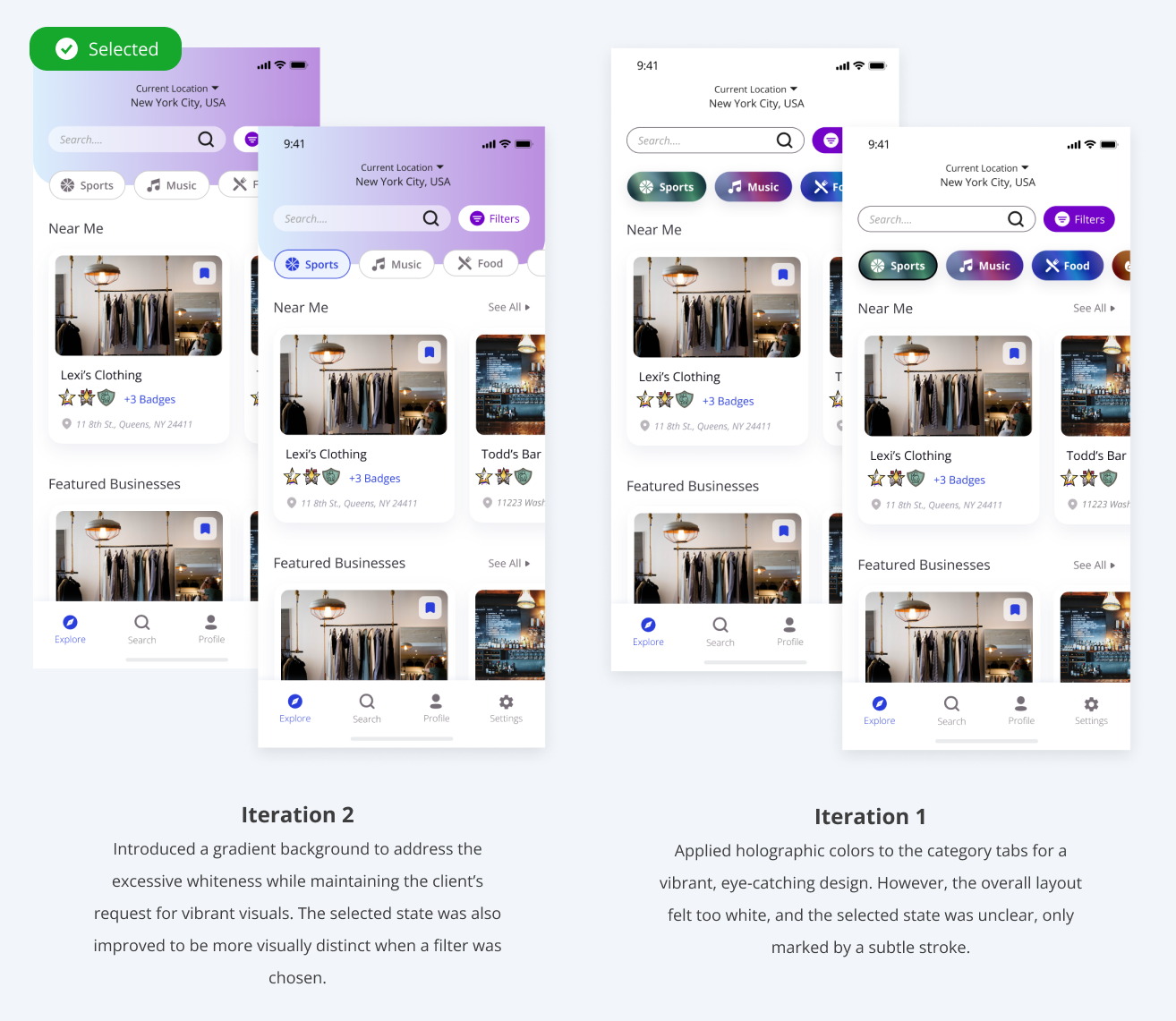
For the Home Screen, I focused on incorporating the requested holographic colors and gradients. In the first iteration, I applied holographic colors to the category tags, creating a sleek and visually appealing design. The second iteration introduced a gradient background, providing a more dynamic and modern aesthetic.
After evaluating both options with the team, we weighed the pros and cons. While the first iteration emphasized the holographic effect, it lacked clarity in indicating the selected state of the tags. The second iteration not only improved the visibility of the selected state but also used the gradient more effectively to create a balanced, visually engaging experience.
Ultimately, the team and client selected the gradient background design for its modern look and clearer visual hierarchy.
Outcomes
The redesigned Sequeer app launched successfully on the App Store in 2022,
1. Product Launch: The app’s relaunch, featuring enhanced accessibility, modern design, and streamlined functionality, resulted in a 25% increase in daily active users within the first three months.
2. Positive Stakeholder Feedback: The final design has been well-received by stakeholders, meeting both user needs and business objectives.
3. User Retention: Thanks to the updated onboarding process that allowed users to skip steps and navigate back and forth, onboarding completion rates improved by 40%, significantly reducing user drop-offs.